Colour speaks before anything else does. Before shoppers read a sign, touch a product, or talk to a salesperson, their eyes react to colour.
In visual merchandising, colour isn’t decoration—it’s strategy. The right colours spark emotion, guide attention, and even influence how people judge price and quality. Sometimes, colour alone decides whether someone stays or walks away.
The Institute for Colour Research found that up to 90% of quick purchase decisions are influenced by colour alone. That makes colour theory one of retail’s most powerful, and often unnoticed, tools.
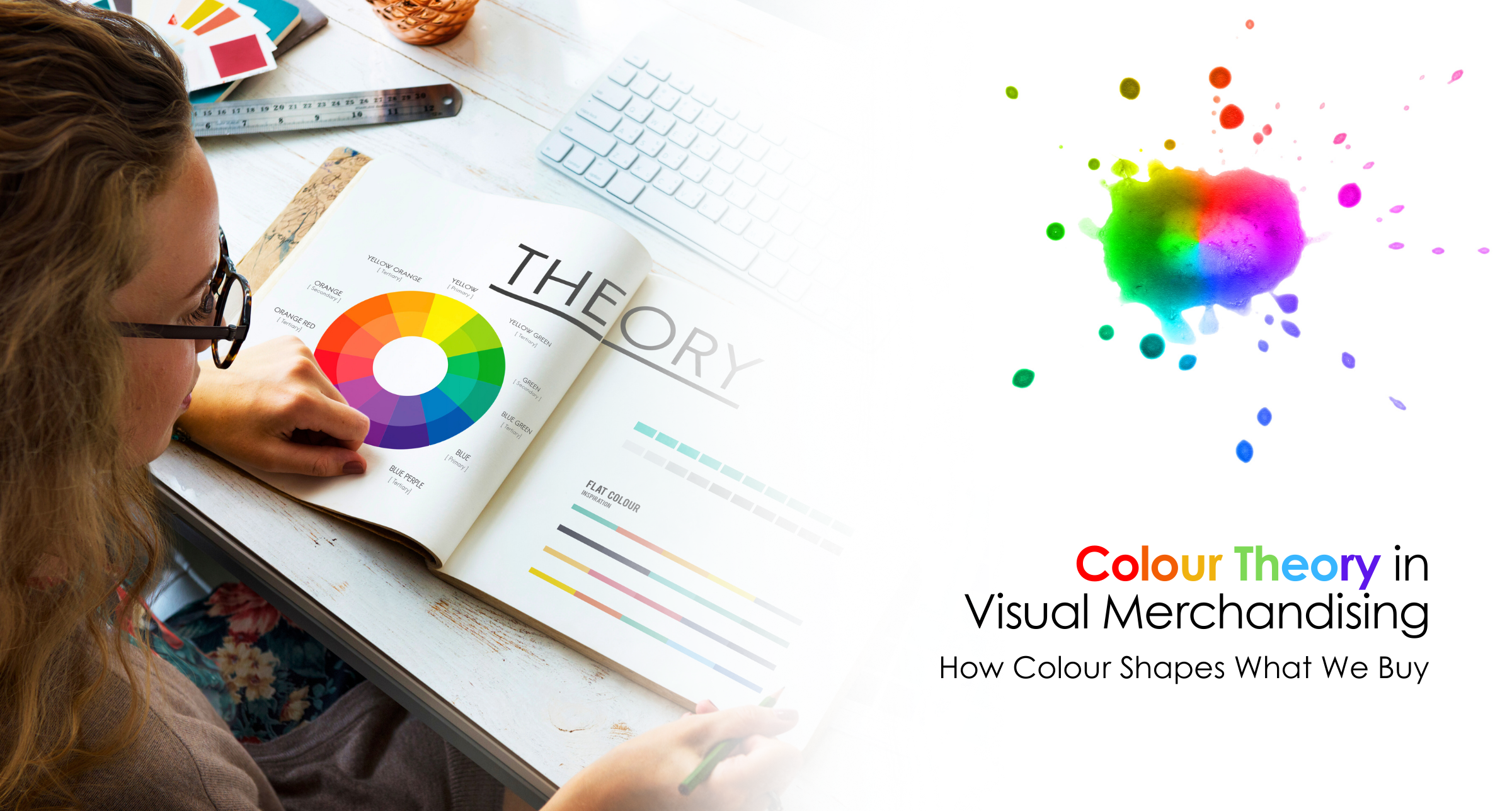
Colour theory explains how colours interact, contrast, and shape mood. In retail, it shows up everywhere—from store floors and walls to displays, signage, packaging, and lighting.
Retailers use colour intentionally to guide shoppers through spaces, highlight products, and trigger emotional responses that encourage buying.
Pantone notes that consistent colour use across branding builds recognition and strengthens emotional connections with customers.
Red boosts excitement and appetite, making it ideal for sales, clearance zones, and promotions.
Common in tech and luxury stores, blue creates a sense of safety, confidence, and reliability.
Yellow grabs attention quickly and works well in window displays, but too much can feel overwhelming.
Green signals health, sustainability, and calm—popular with eco-conscious and wellness-focused brands.
Used carefully, black elevates perception and makes products feel premium.
Harvard Business Review highlights that emotional responses to colour shape long-term brand perception and loyalty.
Colour helps divide a store into sections—new arrivals, promotions, premium zones—without physical barriers. Warm colours attract attention, while cool tones encourage browsing.
Strategic colour placement leads shoppers deeper into the store, increasing dwell time and engagement.
High-contrast colour schemes make featured products stand out, especially in focal displays and end-caps.
Retail Design Blog notes that strong colour contrast improves product recall and visual hierarchy.
Strong brands are instantly recognizable by colour alone.
Forbes reports that consistent colour usage can increase brand recognition by up to 80%.
Colour meanings change across cultures.
Global retailers must adapt colour strategies to local cultural contexts to avoid disconnects.
Technology is reshaping how colour works in stores.
Colour is no longer static—it’s dynamic, measurable, and deeply strategic.
Colour influences emotion, attention, and perception—shaping how shoppers move, feel, and decide what to buy.
There’s no universal answer. Red, blue, and green are common, but effectiveness depends on brand identity, product type, and audience.
Yes. Cool colours encourage browsing, while warm tones drive faster decisions and impulse purchases.
Consistent colour usage builds familiarity, trust, and instant recognition across physical and digital touchpoints.
Absolutely. Consistent colour across digital and physical experiences strengthens brand identity and recall.
GENERAL INQUIRIES
info@gmdrfoundation.com
SOCIAL MEDIA
WhatsApp us

Leave a comment: