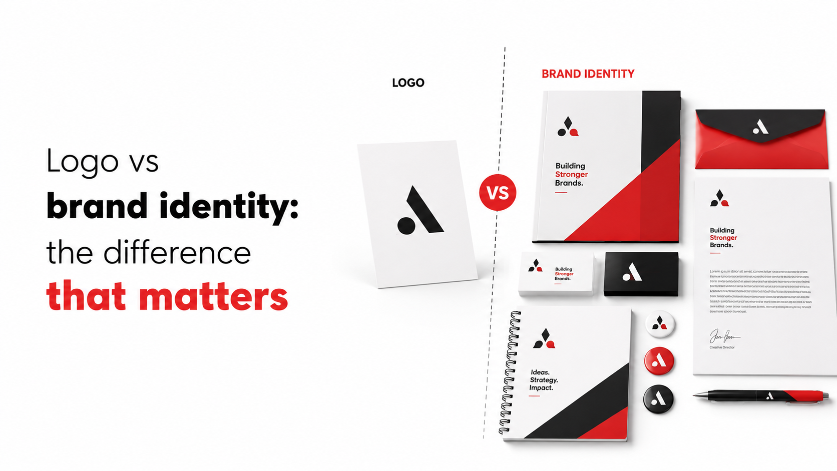
Logo vs brand identity: the difference that matters
What is the difference between a logo and a brand identity? It's one of the most common questions businesses ask, and one of the most consequential to get wrong. Most businesses believe their logo is their brand. It isn't. After working alongside retail brands such as Titan, Shoppers Stop, and Tommy Hilfiger, the team at GDMR Foundation has seen this mistake play out at scale: a business invests in a well-designed logo, assumes the branding work is done, and then watches as every vendor, designer, and social media manager makes their own visual decisions. The result is a brand that looks different at every touchpoint, on every shelf, and across every campaign.
This article covers four things: a precise definition of what a logo actually is, what a brand identity system contains, a clear framework for deciding which one you need and when, and a practical checklist to brief your designer or agency with confidence.
What a logo actually does (and what it cannot)
The single job of a logo mark
A logo is a visual mark, a symbol, wordmark, or combination of both, whose only job is instant recognition and identification. It has no brief, no tone, and no emotional texture on its own. Consider the Nike swoosh and the Apple icon. Both are among the most recognised marks in the world, yet both depend entirely on the larger systems surrounding them. The swoosh carries no inherent meaning without the motivational voice, the athlete imagery, and the performance-driven positioning that Nike has built around it over decades. The mark is the signature; it isn't the personality.
Why a logo alone leaves brands invisible
When a business has a logo but no identity system, every designer, vendor, and printer fills the gap with their own visual judgement. One campaign uses a warm gold background; the next uses cool grey. One vendor prints your signage in a rounded sans-serif; another uses whatever font came with their design software. A logo cannot define how your brand speaks, what colours appear on your retail shelf, or how your packaging feels in a customer's hand. That work belongs to a brand identity system, and without one, brand consistency is simply impossible to maintain at scale.
What is the difference between a logo and a brand identity system?
The visual layer: colour, typography, and imagery
The visual components of a brand identity system begin with a colour palette: primary and secondary colours with defined HEX, RGB, and CMYK codes, not just a colour reference image. Alongside that sits a typography system covering headline fonts, body copy fonts, and hierarchy rules for how they interact.
An imagery style defines the photographic and illustration approach, warm or cool, candid or composed, minimalist or expressive, while an iconography set extends the brand across every application with reusable graphic elements. Each element comes with documented usage rules, because a visual reference without guidelines is not a system.
Coca-Cola's visual identity is a useful illustration. The red-and-white palette and the flowing script lettering carry unmistakable brand meaning even when the logo mark itself is absent. That kind of recognition is built through a defined, consistently applied system, not through a single graphic asset.
The verbal layer: voice, tone, and messaging
Brand identity extends beyond the visual. Voice and tone guidelines define how the brand sounds across every channel, the words it chooses, the register it adopts, and the personality it projects. A messaging hierarchy sets the single most important thing the brand stands for, followed by the supporting messages that reinforce that position.
Consider Amul as an Indian example. The witty, topical, conversational copy on those iconic hoardings is as much a part of Amul's identity as the blue-red-yellow packaging. Neither element needs the logo present to feel unmistakably Amul. That is what a complete verbal identity achieves.
The document that holds it all together
The brand guidelines document is the rulebook that makes the system functional. It ensures every creative partner, printing house, and internal team applies the visual and verbal elements consistently. Without this document, a brand identity is just a collection of files in a shared folder. The guidelines define correct usage, spacing rules, colour application, type hierarchy, and what to avoid. For retail and multi-location brands, this document is the single most important deliverable in any branding engagement.
Logo design vs brand strategy: the real gap
A side-by-side look at brands you already know
Apple's bitten-apple mark is instantly recognisable, but the brand identity is built on minimalist product design, monochrome aesthetics, restrained typography, and a premium, innovation-forward tone. Remove the logo from an Apple product page and the brand is still unmistakable. Nike's swoosh functions similarly: the identity extends through motivational messaging, athlete-centric campaigns, and bold advertising that the mark alone could never carry. Amul's mascot and wordmark are strong marks in isolation, but the real identity is the long-running mascot-led topical advertising, the familiar packaging colour system, and the consistently Indian, conversational voice that has built cultural memory over generations.
What it costs businesses to confuse the two
Treating a logo as a brand identity produces inconsistency at every touchpoint. Signage at one location uses different proportions from the window graphics at another. In-store POSM doesn't align with the social media creative. A new printer or fabrication vendor interprets the brand differently from the last one. For brands running multi-location rollouts, this inconsistency compounds quickly and visibly. The cost isn't abstract: it shows up as customer confusion, diluted brand equity, and rework budgets that could have been avoided with a properly documented identity system from the start.
When to commission a logo versus a full identity system
Situations where a logo-only brief makes sense
There are legitimate scenarios where a standalone logo brief is appropriate. Refreshing a single asset for an MVP or pilot before funding rounds is one. Updating an existing mark while a complete and functional identity system remains intact is another. A quick placeholder during a business pivot, where the full rebrand follows shortly, can also justify a focused logo brief. These are exceptions, not the default approach, and each assumes that an identity framework already exists or will follow soon.
Signs you need the complete brand system
The triggers for commissioning a full brand identity system are clear. You are launching a new business. You are entering retail or physical spaces for the first time. You are running a multi-location rollout. You are onboarding a new signage vendor or production partner. Or your brand currently looks different across every channel it occupies. If any one of these applies, a logo alone will not solve the problem.
On the budget side, a full brand identity package in India in 2026 typically ranges from roughly ₹40,000 for freelance work to ₹5,00,000 and above for agency-led systems with strategy, guidelines, and full deliverables included. That investment makes sense once you account for what inconsistency costs over time.
A practical brand elements checklist to brief your designer or agency
Questions your brief must answer before the first meeting
A useful design brief typically covers six areas. First, business basics and purpose: what the business does, its origin, its mission, and what makes it different from competitors. Second, target audience and ideal customer: who they are, what they value, and what the brand should make them think and feel. Third, competitive positioning: who the competitors are, what is admirable or avoidable about their branding, and where your brand sits relative to them. Fourth, brand personality and values: the three to five adjectives that define the brand's character, the words to avoid, and the single most important message. Fifth, visual direction and references: preferred colours, styles, and examples of brands whose look and feel resonate. Sixth, usage contexts: where the identity will be applied, with particular attention to physical applications such as signage, large-format print, packaging, and retail display. The answer to each of these shapes every design decision that follows.
Deliverables to specify from day one
A proper brand identity engagement should produce a defined set of assets, agreed upon before the project begins. The core deliverables include:
- Primary logo, secondary logo variations, and a submark or icon
- Colour palette with HEX, RGB, and CMYK codes for every colour
- Typography system covering headline and body copy fonts with hierarchy rules
- Imagery style guide covering photography and illustration direction
- Iconography set for reusable graphic elements
- Brand guidelines document with usage rules and what-to-avoid specifications
- Vector source files, web-ready exports, black-and-white versions, and transparent background variants
The production-ready file formats are non-negotiable. These are the files that go directly to printers, signage fabricators, and retail display vendors. Receiving only JPG exports or low-resolution files at the end of a branding project is a common and costly oversight. Insist on vector source files from the start.
When brand identity meets the real world: retail and in-store execution
A brand system that only lives on a screen is incomplete
For retail brands, physical application is where brand identity is tested most severely. In-store graphics, window branding, POSM, promotional counters, and directional signage all draw from the same system, and the tolerances in print and fabrication are tighter than anything a screen will reveal. A brand guidelines document that doesn't account for large-format printing, substrate behaviour across vinyl, flex, acrylic, and ACP, or colour accuracy differences between digital and print will produce inconsistent results the moment execution begins on the ground.
How GDMR Foundation bridges brand strategy and physical execution
GDMR Foundation's role as an integrated production partner is to take a brand identity system from the PDF into the physical world, consistently and at scale. Across commercial digital printing, large-format vinyl and flex, acrylic and ACP signage, POSM, retail display fabrication, and multi-location campaign installation, the team interprets brand guidelines and applies them with precision across every material and surface. The single-partner advantage matters here: one team that understands your brand system from colour codes to substrate specifications removes the coordination risk that comes from briefing multiple vendors separately. For brands expanding across South India or running rollouts across multiple retail locations, that consistency isn't a luxury, it's the difference between a brand that builds recognition and one that starts over at every new store.
The distinction that makes the difference
A logo is a mark; a brand identity is a system. Branding is the ongoing process of putting that system to work across every channel, surface, and interaction. The distinction is not semantic: it determines whether your brand builds recognition over time or resets itself every time a new vendor or campaign manager gets involved.
Before briefing any designer or agency, use the questions in this article to prepare your answers and define your deliverables. Walk into that first meeting knowing your audience, your competitive positioning, and the physical contexts where your brand must perform. That preparation shortens the project, improves the output, and protects the investment.
What a complete brand identity system delivers, when it's executed properly and applied consistently, is the ability to scale into new retail locations and markets without starting from scratch each time. The GDMR Foundation team works with brands at exactly that transition point: from standalone logo to production-ready identity system built for the real world. That is where to start.
FAQs:
Q: What is the difference between a logo and a brand identity?
A: A logo is a single visual mark whose job is instant recognition and identification. A brand identity is the complete system around that mark — colour, typography, imagery, iconography, voice, tone, messaging and documented usage rules — which gives the brand personality and keeps it consistent across touchpoints.
Q: What does a logo actually do and what can’t it do?
A: A logo’s sole job is to identify and be instantly recognisable, as with the Nike swoosh or the Apple icon. It cannot define tone, messaging, consistent colours, packaging feel, or how vendors and partners apply the mark — those needs belong to a brand identity system.
Q: What elements are included in a brand identity system?
A: A brand identity system includes a visual layer (colour palette with HEX/RGB/CMYK codes, typography system, imagery style, and iconography) and a verbal layer (voice, tone, and a messaging hierarchy). Each element must come with documented usage rules so the visual and verbal choices are applied consistently.
Q: When is a logo enough and when do I need a full brand identity?
A: A standalone logo can work for very small operations with few touchpoints, but once a business has multiple vendors, campaigns, packaging, retail presence, or scale, a full brand identity is needed. Without an identity system, different people will make their own visual choices and consistency becomes impossible to maintain.
Q: What should I include when briefing a designer or agency for branding work?
A: Brief your designer with clear objectives and target touchpoints, existing assets, and the audience you need to reach. Specify required deliverables such as a colour palette with HEX/RGB/CMYK codes, typography rules, imagery and iconography styles, voice and tone guidelines, and a messaging hierarchy, plus rules for how each element should be used.
Q: Why do Coca-Cola and Amul feel unmistakable even when their logo isn’t present?
A: Coca-Cola’s red-and-white palette and flowing script serve as strong visual cues, while Amul’s witty, topical copy and distinctive packaging create a verbal identity. These are examples of consistently applied visual and verbal systems that make the brand recognisable even without the logo.
Leave a comment: