

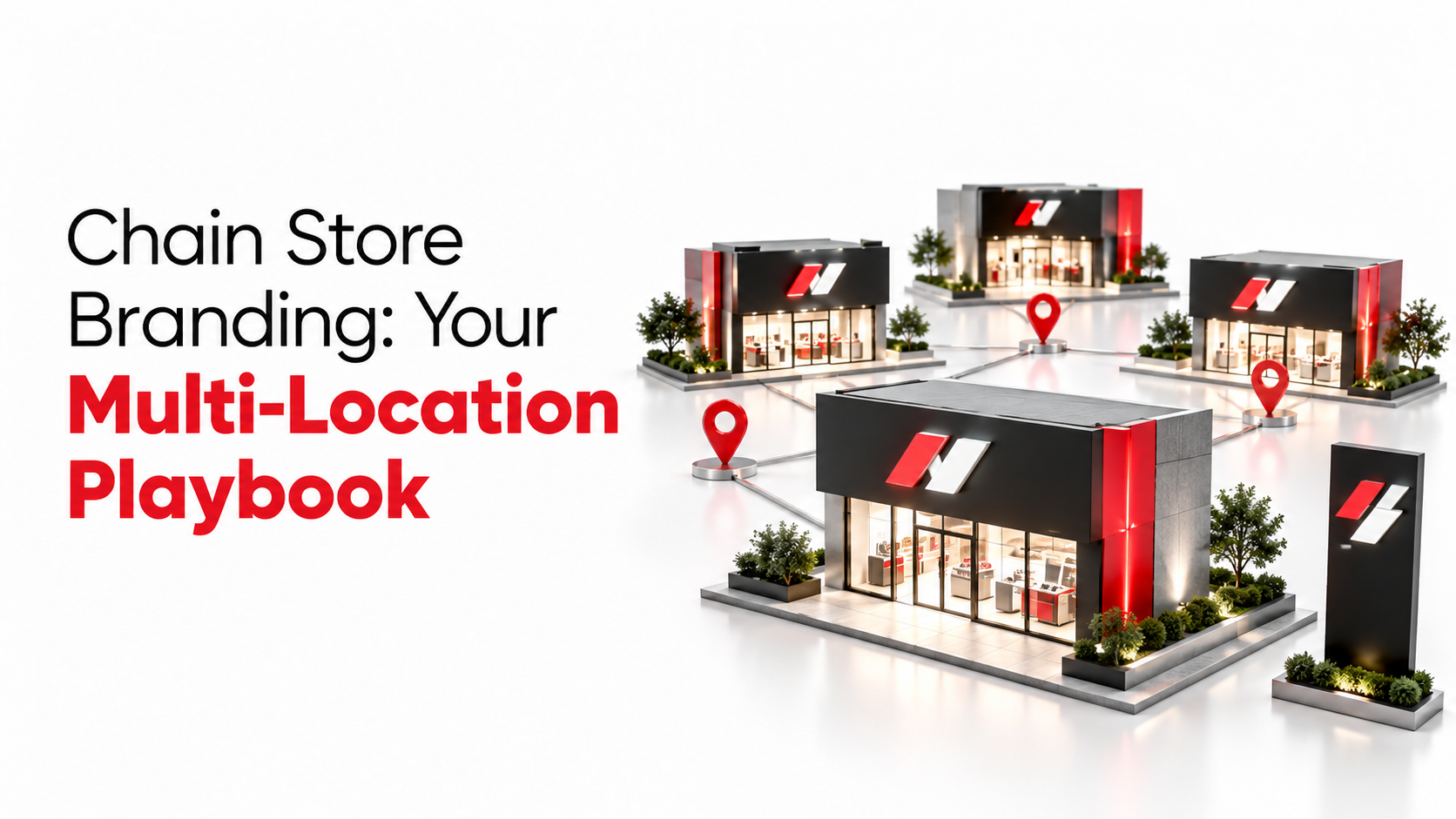
Chain Store Branding: Your Multi-Location Playbook
Imagine that a customer walks into your chain store in Chennai, a well-executed example of consistent chain store branding, picks up a few items, and leaves happy. A month later, the same customer visits your outlet in Lucknow. The logo on the shopfront is familiar, but the signage uses a different typeface. The window graphics look like they came from a competitor's brief. The display layout tells a completely different story from what they saw in Chennai. That brief moment of confusion costs you more than you think. It quietly signals that your brand is not in control of itself.
Inconsistency at scale can materially harm brand recognition and commercial performance for chain retailers. Unlike a single poor product experience, visual inconsistency is diffuse, cumulative, and almost invisible to internal teams who see only one location at a time. But your customers see both. Brand recognition drives purchase intent, and inconsistency fractures both. When your stores do not look like each other, the shopper's subconscious registers disorder before their conscious mind forms a single opinion about your product, and that feeling depresses dwell time and purchase confidence. Retail industry research consistently links perceived store disorder and visual inconsistency to reduced dwell time and lower conversion rates.
This playbook is built for retail brand owners and marketing managers who need to go beyond "we have a logo and brand colours" and build a repeatable chain store branding system. Consistency across locations is not a style preference. It is an operational infrastructure, and it needs to be treated as one.
Why visual consistency is the real competitive advantage for chain stores
What inconsistency costs your brand in practice
Visual inconsistency erodes brand recognition before it touches your revenue line. A shopper who sees mismatched fonts, different material finishes, or misaligned window graphics across two outlets does not file a formal complaint. They feel a vague unease about the brand's quality of management, and that feeling depresses dwell time and purchase confidence. A disjointed brand environment is one of the fastest triggers of that response.
The problem compounds at the staff level. When visual standards are not enforced through clear guidelines and audit systems, frontline teams improvise. A new store manager rearranges the display counter to suit their preference. A regional team orders a banner from a nearby printer without checking the approved colour codes. Over six months, those small deviations accumulate into a brand that looks significantly different depending on which city you visit. The erosion is gradual, which makes it hard to trace back to its source.
What the data from Indian retail actually shows
The growth of India's most successful retail chains is not just a story of product or pricing. It is a story of brand system discipline applied at scale. Big Bazaar expanded from 3 stores to over 295, operating across 80 cities and generating revenues above ₹9,000 crore by FY2014. Zudio grew to over 700 stores across metros and smaller cities while becoming one of Trent's primary profit drivers. FabIndia nearly doubled its retail footprint and trebled its sales over three years, with consistent store experience standards playing a central role in that performance.
What these chains share is not a uniquely talented designer in every city. They share a replicable rollout system: standardised layouts, locked visual-merchandising rules, consistent signage and approved substrates, and a centralised asset governance model that prevents local teams from improvising the brand into incoherence. The growth was possible because the system was repeatable, not because each store was treated as a bespoke creative project.
What your brand guideline must define before any store rollout begins
Chain store branding: the visual identity elements that can never vary by outlet
Your brand guideline is the operational contract between your HQ and every store in your network. It must define your logo system completely: the primary logo, secondary lockups, icon variants, minimum size, required clear space, and explicit don't-do examples for distortion, colour substitution, and incorrect placement.
Alongside this, your colour palette needs exact codes across all four formats:
- HEX, for digital reproduction
- RGB, for screen applications
- CMYK, for print production
- Pantone, for physical substrates
Without these codes, every vendor your stores work with will interpret your brand colour differently, and the result is gradual colour drift that is invisible store by store but unmistakable when you photograph six outlets side by side.
Typography rules deserve the same rigour. Define your approved typefaces, the weights permitted for headings versus body copy, the sizing hierarchy for wayfinding text versus promotional material, and the minimum font sizes allowed on signage. These rules prevent the most common form of visual inconsistency in chain retail: a perfectly correct logo sitting above a fascia that uses a slightly different weight or tracking, because no one specified it.
Signage specifications, approved materials, and store application rules
Your guideline must specify every physical touchpoint where the brand appears, along with the approved materials and finishes for each. Storefront fascia dimensions, window graphic formats, interior wayfinding layouts, POS display standards, and the approved substrate list, acrylic, ACP, vinyl, flex, foam board, and any premium alternatives, should all be documented. The same colour printed on gloss acrylic reads significantly differently from the same colour on matte vinyl, and that visual gap compounds across 50 stores into a brand consistency problem that no amount of centralised artwork control can fully prevent.
Retail-specific application rules matter just as much as the identity elements themselves. Specify how your brand appears on price tags, promotional banners, wobblers, shelf talkers, and display counters. These small touchpoints are the ones that local teams are most likely to improvise under time pressure, and they are the ones that shoppers see at the moment of purchase decision.
Asset governance: the process that keeps the brand honest
A brand guideline without governance infrastructure is an aspirational document. The operational side of consistency requires a centralised asset library with master source files, version control, and approved mockups for storefronts, interiors, and POS applications. A clear approval chain is essential. Consider which adaptations can be made at store level without sign-off, which require regional manager approval, and which must route back to the brand or marketing team. Without this structure, local teams default to improvisation, particularly under the time pressure of a store opening or a promotional deadline. The guideline is only as effective as the system enforcing it.
How to execute chain store branding through signage, graphics, and displays at scale
Storefront and interior signage: setting the first and last impression
Every physical touchpoint in your store has a role in the brand hierarchy. The sequence runs from external fascia and entrance graphics, through interior wayfinding and zone headers, to POS counters and window displays. Each layer must be specified with material, size, finish, and installation method so that different store formats, a 600 sq ft high-street outlet versus a 2,000 sq ft mall store, still read as the same brand. Even small deviations at the fascia level, such as a marginally different font weight or backlit panel brightness, compound across 100 outlets into a visible and commercially meaningful brand inconsistency.
In-store graphics, POSM, and visual merchandising standards
Seasonal campaign graphics, product display inserts, shelf branding, and promotional standees all need to follow the same visual template as your permanent fixtures. Treating campaign materials as one-off creative carries real risk: graphics that ignore the core brand system create a jarring contrast against permanent store elements, which confuses the shopper and dilutes the brand signal at the exact moment you are trying to drive a purchase decision. A visual merchandising standard that covers zone layout, display height, and product grouping logic makes stores scannable, predictable, and consistent for the shopper regardless of which city they are in.
Managing production across multiple locations from a single workflow
Working with five different local vendors across five cities means five different interpretations of your brand guideline, five separate quality control processes, and five sets of handoff errors between printers, fabricators, and installers, the most common failure point occurring precisely at those fabrication handoffs. The practical result is that even a well-written guideline produces inconsistent output when execution is fragmented across uncoordinated vendors.
One model that eliminates this fragmentation is integrated, end-to-end production management, a single partner handling printing, fabrication, precision cutting, finishing, and installation from one coordinated workflow. At GDMR Foundation, this is how retail brands in apparel, jewellery, and lifestyle categories approach consistent output across multiple locations. With capabilities spanning large-format printing, UV printing, rigid media fabrication on acrylic, ACP, and PVC board, and on-site installation, the production chain sits within one accountable workflow, reducing the quality variation that fragmented vendor management so often produces.
Balancing central brand standards with local store adaptation
What to lock centrally and what stores can adapt
Every multi-location brand faces the same tension: too rigid, and local relevance suffers; too flexible, and the brand erodes. The resolution is a guardrails-plus-flexibility model. Your core identity elements, logo, primary colours, typefaces, key visual rules, and brand tone, are HQ territory and non-negotiable. The execution of local relevance, specific promotional offers, regional event formats, limited-time messaging, and certain product assortment choices, is store territory, within approved boundaries.
A Diwali promotion is a useful concrete example. The offer and product focus can vary by region: a Kerala store may emphasise different products than a Delhi outlet. But the visual execution must follow the centralised campaign template. The typography, colour application, and layout logic stay locked. What changes is the content within a pre-approved structure, not the structure itself.
Building localisation templates that protect the brand without slowing teams down
The practical mechanism for this model is a set of pre-approved design templates for common local needs: seasonal promotions, regional event signage, and local product launches. These templates have locked brand elements and clearly marked editable fields, so there is no ambiguity about what can and cannot be changed. A store team can produce a localised promotional banner in minutes without a design brief, a vendor negotiation, or a risk of brand damage, because the creative guardrails are built into the template itself.
Governance tiers should be explicit: some adaptations are permitted at store level without approval, others need a regional manager's confirmation, and others must route back to the brand team. Writing these tiers into the localisation playbook removes the most common cause of brand drift, not malicious improvisation, but well-intentioned teams making decisions in the absence of clear rules.
Budgeting and timelines for a multi-store branding rollout in India
What chain store branding actually costs per store in the Indian market
Retail branding costs in India vary significantly by scope and finish level. Basic signage and vinyl graphics for a small store typically fall in the ₹15,000, ₹30,000 range. A comprehensive branding package for a 1,000 sq ft retail store, covering wall graphics, window branding, POS displays, and visual merchandising elements, typically runs between ₹75,000 and ₹2,00,000. Premium rollouts involving illuminated signage, 3D channel letters, ACP cladding, or custom fabricated display counters move well above ₹2,00,000, depending on materials, finishes, and city tier. (Figures are indicative market references for 2026 and vary by city, vendor, and finish level.)
For per-element planning, common benchmarks include: wall prints at approximately ₹110, ₹150 per sq ft, acrylic laser-cut logos at ₹600, ₹800 per sq ft, and digital or interactive display panels at ₹50,000, ₹1,00,000 or more. A practical planning rule for common retail branding elements is ₹100, ₹250 per sq ft, with premium finishes and fabricated elements pushing the effective rate significantly higher.
Planning a realistic timeline by rollout phase
Simple signage and vinyl jobs typically require 1, 3 days for production and installation per store. Medium-scope rollouts covering multiple elements, site measurements, and approval rounds generally take 3, 7 days. Complex fabrication rollouts involving ACP boards, 3D signage, illuminated fascias, or coordinated multi-location installations typically require 1, 3 weeks or more per cluster of stores.
For large chains, staggered rollout planning is not optional. Launching all 50 stores simultaneously without a phased schedule is a quality reliability risk, not a logistics preference. A production partner managing the end-to-end workflow compresses these timelines because there are no handoff delays between printers, fabricators, and installation teams. Every day saved in production coordination is a day closer to consistent chain store branding across your full network.
How to measure whether your chain store branding is working
The KPIs that actually tell you if the refresh is performing
Three layers of measurement give you a complete picture of branding impact. Track them together rather than in isolation, each reveals something the others cannot.
Commercial layer: footfall (total store visits, entry rate, like-for-like growth), conversion rate (visit-to-purchase, basket conversion), and average transaction value (ATV, units per transaction, basket size distribution).
Behavioural layer: branded search volume, direct traffic, and branded discovery metrics. A branding refresh often changes how customers find and trust your stores before it changes what they buy, so this layer often moves first.
Perceptual layer: aided and unaided brand awareness, net promoter score, and brand attribute ratings.
Measuring only footfall without conversion gives an incomplete picture. A branding refresh may drive more people through the door without changing purchase behaviour, a partial win, but not the commercial outcome you are investing for. All three layers need to be tracked together to understand what the branding change is actually driving.
Setting up a pre/post measurement framework that isolates brand impact
The most reliable attribution method combines baseline tracking with matched control stores. Record baseline KPIs for 4, 8 weeks before the rollout begins, then compare post-rollout performance over the same trading windows against a set of matched control stores that did not receive the refresh. If refreshed stores show a 12% footfall lift and control stores show 3% over the same period, the brand-attributable lift is approximately 9%, not 12%. That difference matters when you are making investment decisions about the next phase of your rollout.
For phased rollouts, comparing early-launch locations to delayed-launch locations gives cleaner causal evidence of what the branding change is driving, independent of seasonal trading patterns or regional market movements. A difference-in-differences comparison across a staggered rollout is a practical, commercially credible method available to retail brand teams operating within normal budget and data constraints.
Build the system, then trust it
Bring this back to your customer in Chennai and Lucknow. When they walk into your second store, they should feel the same brand, see the same quality of execution, and receive the same visual cues about what you stand for. That experience is not the result of individual creative talent at each outlet. It is the output of a replicable chain store branding system: a tight brand guideline, a disciplined rollout process, a localisation framework with real guardrails, and a measurement habit that holds the investment accountable.
Start with the brand guideline. Define what cannot vary, document it with specificity, build governance infrastructure around it, and then work outward to rollout, localisation, and measurement. Each layer depends on the one before it, which is why starting with a logo and a vague colour palette is not enough to sustain consistency across 20 or 200 locations.
If production coordination across locations is the bottleneck in your chain store branding rollout, an integrated partner managing printing, fabrication, finishing, and installation removes the need to coordinate multiple vendors across multiple cities. Contact the GDMR Foundation team to scope your next store rollout or brand refresh. Brand consistency across every location is not just a design standard, it is a compounding commercial asset that grows more valuable with every store you open.
FAQs:
Q: What is chain store branding and why does it matter for multi-location retailers?
A: Chain store branding is the repeatable visual and operational system that ensures every outlet presents the same brand experience. It matters because visual consistency drives brand recognition, which in turn supports dwell time and purchase confidence; inconsistency fractures recognition and reduces conversion across locations.
Q: How does visual inconsistency across outlets hurt sales and customer perception?
A: Visual inconsistency—mismatched fonts, different material finishes, or misaligned window graphics—creates a vague unease in shoppers that lowers dwell time and purchase confidence. The effect is diffuse and cumulative: small local deviations accumulate into a brand that looks different by city, which research links to reduced conversion rates.
Q: What elements should a brand guideline define before any store rollout begins?
A: A guideline should lock the visual identity elements that can never vary, including standardised layouts, locked visual-merchandising rules, consistent signage and approved substrates, approved colour codes and typefaces, and the governance process for asset approvals. Treating the guideline as operational infrastructure ensures local teams cannot improvise the brand into incoherence.
Q: How did successful Indian retail chains use branding discipline to scale?
A: Chains like Big Bazaar, Zudio and FabIndia grew by applying a replicable rollout system rather than bespoke creatives for each store. Examples include Big Bazaar expanding from 3 to over 295 stores across 80 cities with revenues above ₹9,000 crore by FY2014, Zudio growing to over 700 stores, and FabIndia nearly doubling its footprint while trebled sales over three years, all backed by standardised layouts and centralised asset governance.
Q: What operational systems stop local teams from improvising brand assets?
A: Centralised asset governance, clear guidelines, approval workflows and regular audits prevent local improvisation. When these systems lock approved substrates, signage specifications, colour codes and visual-merchandising rules, frontline staff no longer substitute locally printed banners or rearranged displays that fragment the brand.
Q: How can I maintain consistency across hundreds of store locations?
A: Build a repeatable rollout system: standardised store layouts, locked visual-merchandising rules, consistent signage and substrate specifications, plus a centralised approval and audit process. Train regional teams on the guideline and enforce approvals so stores are operated as implementations of a system, not bespoke creative projects.
Q: What are early signs that my chain store brand is becoming inconsistent?
A: Early signs include customers noticing different typefaces or window graphics between cities, displays that tell different stories, and local teams ordering unapproved banners or rearranging fixtures. These small deviations are hard to spot internally but quickly accumulate and erode brand recognition if not caught by governance and audits.

Leave a comment: