

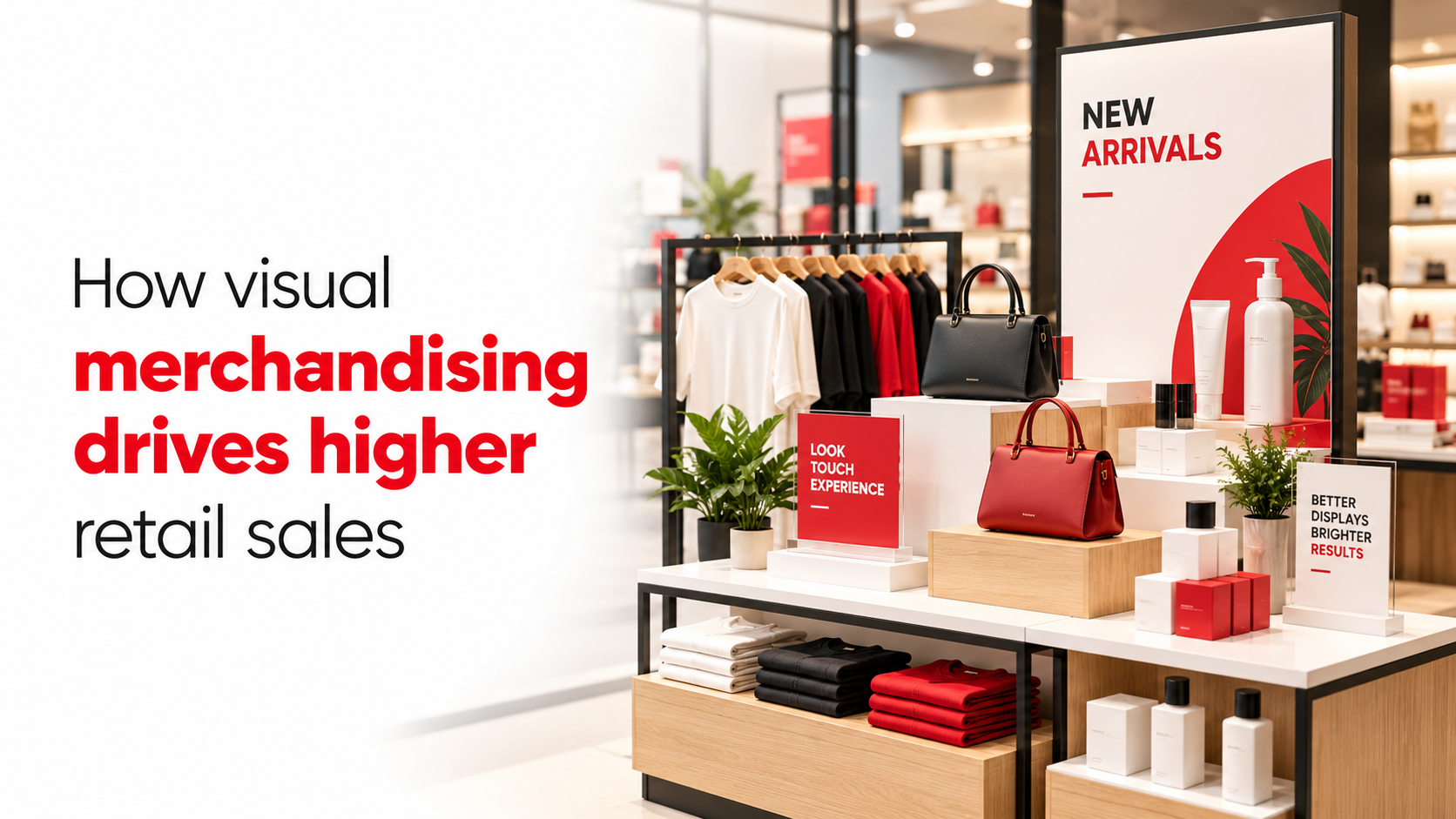
How visual merchandising drives higher retail sales
How does visual merchandising increase retail sales?
One survey found that roughly half of respondents reported buying more than they had planned, attributing the behaviour to in-store visual merchandising cues. If your store is not deliberately engineering those cues, you are handing that revenue to a competitor who is.
Visual merchandising is not about making a store look attractive. It is a structured psychological system that converts footfall into transactions by directing attention, building dwell time, and triggering purchase decisions at the right moment. Industry estimates suggest that a large proportion of purchase decisions are made inside the store rather than before the shopper walks in, which makes the store environment itself your most powerful sales tool.
This article explains the behavioural mechanisms behind VM, gives you nine practical tactics with quick setup steps, and tells you which KPIs confirm that your efforts are translating to revenue.
How visual merchandising increases retail sales: the psychology behind shopper decisions
How the brain processes a retail environment in seconds
Shoppers make most in-store decisions rapidly and subconsciously. Visual hierarchy, contrast, and novelty trigger peripheral processing, which means a well-executed display catches attention before the shopper has consciously decided to look at it. This stopping power, the share of passers-by who pause at a display, is the first behavioural hurdle every VM tactic must clear, and practically speaking, it is won or lost within the first few seconds of exposure.
The dwell time and conversion link
Every VM decision, whether product height, focal point placement, or aisle width, is ultimately a decision about where you want attention to land and how long you want it to stay. The evidence is consistent: the longer a shopper engages with a display, the higher the probability of a purchase. Frame every VM choice around stopping power and dwell time, and the tactics below become logical decisions rather than aesthetic ones.
Product placement and planograms that guide the shopper journey
Eye-level placement and the decompression zone
The first 5 to 10 feet inside your entrance is the decompression zone, where shoppers are still adjusting to the new environment and rarely register merchandise placed there. Place your hero SKUs just past this zone, not inside it. A clean, uncluttered entrance settles the shopper mentally and sets the frame for the rest of the visit, supporting longer browsing and stronger conversion deeper in the store.
Special displays vs. standard shelves
Moving a product from a regular shelf to a special in-store display can produce substantial sales uplift, though results vary considerably by category, display type, and store context. Field experiments have documented increases in the range of 77% to over 240% versus standard shelf placement in some categories, driven by novelty, visual prominence, and the implicit signal that the product has been curated. Planograms lock that placement into repeatable execution across one store or fifty, and cross-merchandising complementary items on the same display is a clear driver of average transaction value growth.
How visual merchandising drives retail sales through lighting, colour, and sensory design
How colour psychology directs attention and mood
Warm tones, red, orange, amber, create urgency and work well for promotions, impulse zones, and clearance areas. Cool tones such as blue and green build trust and support considered, premium purchases. Use one dominant colour with one or two accent colours to create visual hierarchy rather than a competing palette. In Indian fashion and lifestyle retail, research indicates that red and orange are strongly associated with impulse decisions at point-of-sale displays and checkout zones, a pattern worth incorporating into your retail store layout optimisation.
Lighting as a conversion tool, not just ambience
Warm white lighting enhances skin tones, textiles, and lifestyle products, making them feel richer and more premium. Cool white increases sharpness and detail visibility, making it better suited to electronics and precision-led categories. Accent lighting that spotlights a display fixture signals importance to the shopper before they consciously register the product. One study of interactive digital displays reported approximately 25% sales uplift across the overall display package, though isolating illumination and motion as the specific drivers would require dedicated testing within your own store context.
Window displays, signage hierarchy, and focal points
Window displays as the first conversion touchpoint
A well-executed window display can meaningfully increase foot traffic, industry figures commonly cite figures in the region of 20%, and trade data consistently suggests that compelling visual storytelling has a greater impact on impulse purchasing than discount offers alone. The rule is straightforward: one clear story, one focal point, and a visual hierarchy that reads in under five seconds from the pavement. The most common mistake is overcrowding the window until the message disappears entirely behind the product.
Signage hierarchy and producing VM briefs that work in-store
Effective in-store signage operates across three tiers: a headline that captures attention from approximately 3 to 4 metres away; a sub-message that delivers the offer or benefit at arm's reach; and a price or call to action that triggers the decision at point of contact. Think of this as a practical heuristic rather than a fixed rule, your specific store dimensions and footfall patterns should guide the exact distances. Each tier must be produced on the right material at the right size to function correctly, because a brilliant VM concept executed on poorly printed materials loses its impact at the final metre.
This is where production quality becomes a strategic variable. For retail brands across South India, GDMR Foundation provides the bridge between an approved VM brief and a store-ready display, covering custom window graphics, printed POSM, fabricated retail counters, and in-store branding for single locations and multi-store rollouts. The visual merchandiser role on a store team defines the strategy; the production partner determines whether that strategy survives contact with the shop floor.
Nine VM tactics with quick setup steps for your store
1. Entrance power wall
Place one hero SKU line with brand signage and a focused spotlight on the main sightline immediately past the decompression zone. Keep the wall sparse, face all products outward, and replace any low-stock or damaged item the same day. Refresh with every new launch or festival, and run a visual reset every 10 to 14 days to maintain the novelty signal that creates stopping power.
2. Window story display
Build one clear narrative using mannequins or standees, three to five supporting items, a clean backdrop, and focused lighting. The goal is a single legible story that reads from the pavement in under five seconds. Assign a staff member to clean the glass, wipe props, and confirm all lights are working before the store opens, and update the composition at least weekly or with each new promotion.
3. Festive capsule table
Place eight to twenty high-conversion SKUs on a table with risers and festive-coloured props in the front third of the store or first main aisle. Deploy two to three weeks before Diwali, Eid, or a major local festival and rotate weekly during the season. Keep one clear theme, avoid mixing unrelated categories, and restock before peak evening footfall to prevent the table from looking depleted.
4. Cross-sell bundle rack
Group complementary items as a styled ensemble rather than by product category, using bundle shelf-talkers to frame the combination. Train staff to pair the hero item verbally with two or three add-ons at trial and billing. Rebuild the rack whenever the core item changes and especially at collection launch or promotional windows to keep the bundle story current and the display fresh.
5. Colour-coded category bay
Arrange stock by colour family using one base colour and one or two accents so the bay reads as calm and shoppable rather than visually noisy. Rework with each new shipment or season, and run micro-refreshes every 10 to 14 days. Provide staff with a reference display photograph and brief them to remove stray or off-colour items during every floor walk.
6. Checkout impulse tray
Place a small basket or tray beside the billing counter with only high-margin, compact, easy-to-grab items and a clean price card. Refill regularly throughout the day and accelerate the product swap during peak festive footfall periods. Brief cashiers to mention one add-on item per transaction as part of the standard checkout conversation rather than leaving the tray to perform on its own.
7. Storytelling fixture with planogram
Assign every SKU a fixed slot on a planogram, label the fixture by theme or collection, and run a clear story flow from entry hero to mid-store support to back-end conversion products. Use one or two signage cards to anchor the narrative across the fixture. Send store photos for same-day correction whenever the setup drifts from the planogram brief, keeping execution consistent across all locations.
8. Discount wall by size
Organise clearance stock by size within each style so shoppers can compare quickly without disrupting the display. Update price tickets the moment markdown decisions are made, and keep the most discounted items visible and within easy reach. Activate this zone during end-of-season clearances or payday-led sales pushes to maximise sell-through velocity while the commercial window is open.
9. Slow-hour reset zone
Use low-traffic periods or post-closing time to rebuild any display that looks tired, depleted, or off-brief. Clean the fixture first, then rebuild from the largest element to the smallest until the display looks balanced and simple again. Prioritise windows, entrance tables, and rack ends, as these are the highest-visibility zones that shape every shopper's first impression of the store.
KPIs that tell you your VM is actually working
Behavioural and sales metrics to track
Track at least one behavioural metric and one commercial metric per VM change to attribute performance accurately. Behavioural metrics include footfall, stopping power, and dwell time. Commercial metrics include conversion rate, average transaction value, units per transaction, sell-through rate, and sales per square foot. Use them together rather than in isolation, footfall alone can look positive even when conversion and basket value do not improve. The practical ROI formula is: Incremental Sales minus Campaign Cost, divided by Campaign Cost, multiplied by 100.
A/B testing your in-store visual merchandising
Practical tests can be set up without specialist equipment. Compare window display concept A against concept B across alternating weeks, measuring footfall and conversion rate. Test endcap placement against a standard shelf using the same SKU, measuring sell-through and units per transaction. Compare a price-led sign against a benefit-led sign, measuring stopping power and dwell time at that fixture. Always set a pre-change baseline and use a control zone wherever possible to separate VM impact from seasonal or promotional effects.
Treat visual merchandising as a system, not seasonal decoration
Understanding how visual merchandising increases retail sales is less about creative instinct and more about structured application, psychology, placement, material quality, and consistent execution on a planned refresh cycle working together. Retailers that treat VM as an ongoing system and measure execution with the right KPIs tend to achieve better commercial outcomes than those that treat it as occasional decoration between campaigns.
The most effective next step is a structured audit of your current store layout against the nine tactics covered here. Identify the two or three highest-impact gaps, implement them using the setup steps above, and track the KPIs for four weeks. The results will tell you exactly where to invest next.
For retail brands and store teams across South India, GDMR Foundation operates as the production partner that moves VM strategy from approved artwork to installation-ready reality: custom window graphics, printed displays, fabricated counters, POSM, and multi-location rollouts managed through a single integrated workflow. Get in touch with our team to discuss how we can support your next in-store campaign or store rollout.
FAQs:
Q: How does visual merchandising increase retail sales?
A: Visual merchandising converts footfall into transactions by directing attention, increasing dwell time, and triggering purchase decisions in-store. Many purchase decisions happen after a shopper enters, so engineered visual cues steer attention to the right products at the right moment and lift conversion.
Q: What is 'stopping power' in visual merchandising and why does it matter?
A: Stopping power is the share of passers-by who pause at a display; it’s the first behavioural hurdle for any VM tactic. Since peripheral processing catches attention within seconds, a display that wins stopping power increases the chance shoppers will engage and eventually buy.
Q: How does dwell time affect conversion rates?
A: Dwell time correlates with purchase probability: the longer a shopper engages with a display, the higher the likelihood of a sale. VM choices:product height, focal placement, aisle width, should be framed to maximize where attention lands and how long it stays.
Q: What and where is the decompression zone, and where should I place hero SKUs?
A: The decompression zone is the first 5 to 10 feet inside the entrance where shoppers are still adjusting and rarely register merchandise. Place hero SKUs just past this zone and keep the entrance clean and uncluttered to settle shoppers and support deeper browsing and stronger conversion.
Q: Do special in-store displays really outperform standard shelves?
A: Yes, field experiments have shown substantial uplifts, with increases reported from about 77% to over 240% versus standard shelf placement in some categories. The gains come from novelty, visual prominence, and the curated signal; using planograms and cross-merchandising on those displays helps lock in and amplify results.
Q: How should I use colour and lighting to drive purchases?
A: Use warm tones (red, orange, amber) to create urgency for promotions and impulse zones, and cool tones (blue, green) to build trust for considered or premium purchases; pick one dominant colour with one or two accents to maintain visual hierarchy. Treat lighting as a conversion tool and use it to highlight focal points and create contrast, not just ambience.
Q: What role do planograms play in visual merchandising at scale?
A: Planograms lock product placement into repeatable execution so the same visual hierarchy and focal-prominence can be maintained across one store or fifty. They ensure hero SKUs and cross-merchandising strategies are consistently implemented, which supports predictable sales uplifts.
Leave a comment: